Top Ten Tuesday is a bookish meme hosted by The Broke and the Bookish.
This week's topic is:
top ten covers we wish we could redesign
Here's my list:
More than half the times, I tend to judge a book by it's cover so this is going to be very interesting. Also, I've only added books I've read on my list.
This series is all about pretty covers and a stupid story. Passion's cover just does not match up to the other pretties.
I have no idea what sort of redesign would work here. The covers are cool really, but they somehow don't match up to the characters in the stories.
There's actually a Goodreads list with book covers that have Daemon and Katy from the Lux series as the cover models. Um, aren't there any other models?
There are two covers for this book. The story was so good and the covers actually convey something from the story, but I don't know... I wish there was more when it comes to the cover.
I used to swoon over this series at one point in my life and honestly, if I were to judge the books by the covers (which I didn't back then), it screams boring.
This is the most hilarious book I've read till date and that cover just does not do justice to how good the book really is.
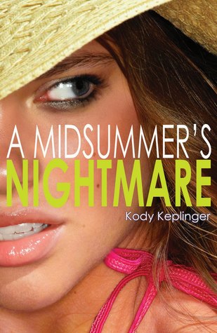
Two extraordinary stories, two very simple, plain and ordinary covers- just no.
Would you read this series based on the covers? I wouldn't. I read the book anyway and it's one the cutest Young Adult Contemporary series ever.
Yeah Mr. Rushdie, what was your point? To make the cover as amusing and confusing as the story?
Link me up to your lists in the comments below as I'd love to see what you've picked!


Nice picks! I kind of like the Daemon and Katy covers for the Lux books. Seeing them on other books is weird though! On one UK cover for a Katie...Gerry? Can't recall the last name now, they had the "Katy" chick being this weird color blonde. And yeah, it was weird since I am used to her as the dark brown Kat.
ReplyDeleteHere's my Tuesday Post
Have a GREAT day!
Old Follower :)
Hahaha, I should go check that one out. Thanks for stopping by, Jessica.
DeleteDefinitely agree with the What a Boy Wants covers! That's probably the reason why I haven't read that series yet...
ReplyDeleteExactly my point, but it's such a good series. Thanks for stopping by, Erica.
DeleteSome really great picks! The What A Boy Wants have better covers here, but not by much! My TTT.
ReplyDeleteAh, they do? I must check it out. Thanks for stopping by!
DeleteI totally agree with the Lux series models. I see them ON EVERYTHING! Give someone else a chance to shine!
ReplyDeleteHere's My TTT
I know right! Totally agree with you there, Nikki. Thanks for stopping by.
DeletePassion does look creepy!
ReplyDeleteCheck out Our TTT
Doris @ OABR
Doesn't it? Thanks for stopping by, Doris.
DeleteI totally agree about Daemon and Katy covers, same is for the guy from Easy cover. I mean he has cool tattoos and everything, but it's too much. I haven't heard of some of these but I agree with you, they do need a redesign :) Great picks :)
ReplyDeleteI wanted to put the Easy guys on my list, but couldn't find a GR list for them. Thanks for stopping by, Tanja.
DeleteBahahaha!! Yes, to all above! I'm tired of all the Daemon and Katy cover lovers out there too. :P
ReplyDeleteHahaha, so glad you agree, Ali!
DeleteAh, glad we agree on some choices, Aman. I'll go see your picks!
ReplyDelete